多子图
阅读: 4993 评论:0很多时候,我们需要从多个角度对数据进行比较,在可视化上也是一样的。Matplotlib通过子图subplot的概念来实线这一功能。
一、手动创建子图
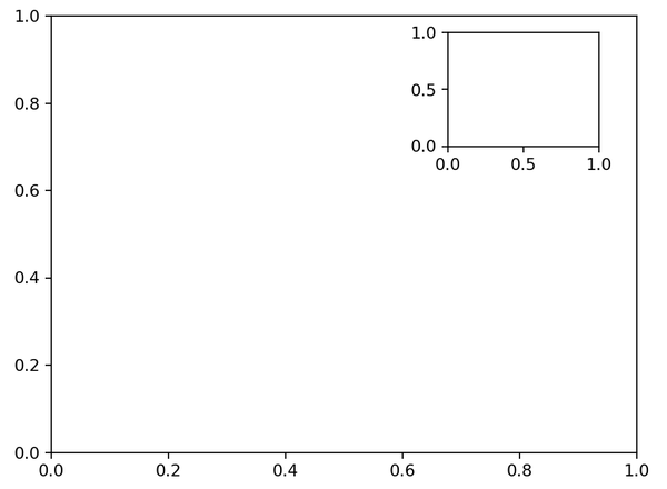
通过plt.axes函数可以创建基本子图,默认情况下它会创建一个标准的坐标轴,并填满整张图。但是我们可以通过参数配置,实现想要的子图效果。
这个参数是个列表形式,有四个值,从前往后,分别是子图左下角基点的x和y坐标以及子图的宽度和高度,数值的取值范围是0-1之间,画布左下角是(0,0),画布右上角是(1,1)。
下面我们看个例子:
ax1 = plt.axes()  # 使用默认配置,也就是布满整个画布
ax2 = plt.axes([0.65,0.65,0.2,0.2]) # 在右上角指定位置
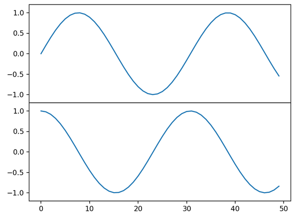
上面是Matlab接口的风格,面向对象画图接口中有类似的fig.add_axes()方法:
fig = plt.figure()
ax1 = fig.add_axes([0.1,0.5,0.8,0.4],xticklabels=[],ylim=(-1.2,1.2))
ax2 = fig.add_axes([0.1,0.1,0.8,0.4],ylim=(-1.2,1.2))

x = np.linspace(0,10)
ax1.plot(np.sin(x))
ax2.plot(np.cos(x))
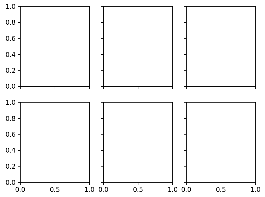
二、 plt.subplot方法
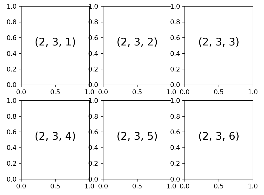
subplot的方法接收三个整数参数,分别表示几行、几列、子图索引值。索引值从1开始,从左上角到右下角依次自增。
for i in range(1, 7):  # 想想为什么是1-7
    plt.subplot(2,3,i)
    plt.text(0.5,0.5,str((2,3,i)), fontsize=16, ha='center')
子图间距好像不太恰当,可以使用plt.subplots_adjust方法进行调整,它接受水平间距hspace和垂直间距wspace两个参数。
同样的,面向对象接口也有fig.add_subplot()方法可以使用:
fig = plt.figure()
fig.subplots_adjust(hspace=0.4, wspace=0.4)
for i in range(1,7):
    ax = fig.add_subplot(2,3,i)
    ax.text(0.5,0.5,str((2,3,i)), fontsize=16, ha='center')
三、 快速创建多子图
可以使用subplots()方法快速的创建多子图环境,并返回一个包含子图的Numpy数组。
fig, ax = plt.subplots(2,3,sharex='col', sharey='row')
通过sharex和sharey参数,自动地去掉了网格内部子图的坐标刻度等内容,实现共享,让图形看起来更整齐整洁。
通过对返回的ax数组进行调用,可以操作每个子图,绘制图形:
for i in range(2):
    for j in range(3):
        ax[i,j].text(0.5,0.5,str((2,3,i)), fontsize=16, ha='center')
结果不再展示。但是需要注意的是,subplot()和subplots()两个方法在方法名上差个字母s外,subplots的索引是从0开始的。
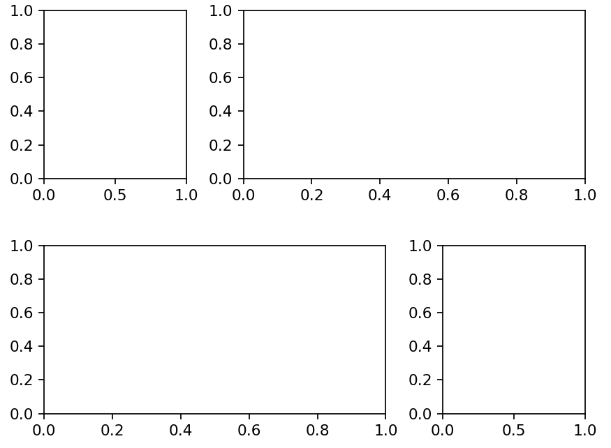
四、GridSpec 复杂网格
前面的子图其实都比较规整,如果想实现不规则的多行多列子图,可以使用plt.GridSpec方法。
grid = plt.GridSpec(2,3,wspace=0.4,hspace=0.4) # 生成两行三列的网格

plt.subplot(grid[0,0]) # 将0,0的位置使用
plt.subplot(grid[0,1:]) # 同时占用第一行的第2列以后的位置
plt.subplot(grid[1,:2])
plt.subplot(grid[1,2])
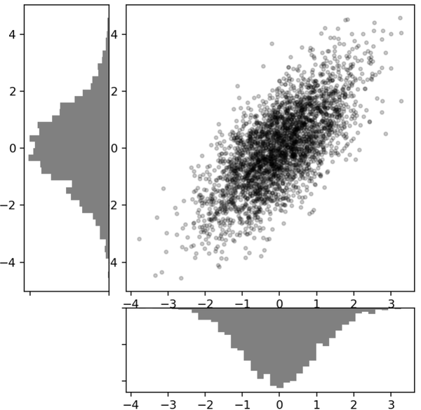
下面是一个使用plt.GridSpec方法创建多轴频次直方图的例子:
# 创建一些正态分布数据,这不是我们关心的内容
mean = [0, 0]
cov = [[1, 1], [1, 2]]
x, y = np.random.multivariate_normal(mean, cov, 3000).T

# 建立网格和子图
fig = plt.figure(figsize=(6, 6))
grid = plt.GridSpec(4, 4, hspace=0.2, wspace=0.2)
main_ax = fig.add_subplot(grid[:-1, 1:])  # 注意切片的方式
y_hist = fig.add_subplot(grid[:-1, 0], xticklabels=[], sharey=main_ax)
x_hist = fig.add_subplot(grid[-1, 1:], yticklabels=[], sharex=main_ax)

# 在主子图上绘制散点图
main_ax.plot(x, y, 'ok', markersize=3, alpha=0.2)

# 在附属子图上绘制直方图
x_hist.hist(x, 40, histtype='stepfilled',
            orientation='vertical', color='gray')
x_hist.invert_yaxis() # 让y坐标轴的值由大到小,逆序

y_hist.hist(y, 40, histtype='stepfilled',
            orientation='horizontal', color='gray')
y_hist.invert_xaxis() # 可以尝试不要这行,看看结果